One of the key things UX designers and product managers focus on is how to reduce friction for their users while using their products. If there is any UX pattern in our product which causes confusion in the minds of the user, they have to double guess how to use it, or they have to put more thought than necessary into using it, we have failed.
One such product that bothers me a lot is the tap or faucet. (Don Norman wrote about it in his book The Design of Everyday Things)
You use a tap in a very simple way – you turn a knob that sits on top of the device anticlockwise to start the water flow, clockwise to stop it, the water flows out of a spout in the vicinity of the knob, and the flow of water is governed by how much you have turned the knob.
Like this one: 
This is simple, universal, does the job every time as expected, and there really isn’t any reason to make any changes in the fundamental structure of this device. And if I encountered a tap like this everywhere I went throughout my life, I am not going to complain.
Yet, we see the following variations of the tap at various places, where the variations are not just in scale, shape, texture, material, but in how the tap is used:
We are left confused as to which component to turn to use the tap, or which way to turn it, or whether we are turning it in the right axis even, or whether we have to push on the “knob” instead of turning it! Why have tap designers gone to these lengths to confuse us while using such a simple device? Mind you, I am not even talking about faucets where both hot and cold water comes and there are complex knobs to ensure you get the right temperature by mixing both, or sensor-driven taps, where you don’t need to touch the tap to activate it (they come with their own challenges – where exactly do I place my hand so it works? The tap next to mine seems to be working – why isn’t mine working?).
In Software Design
What are some of such scenarios in software & app design where the interface has been over-engineered to the detriment of user experience?
- Synthetic scroll: This was a pattern in vogue on blogs and magazine sites a couple of years back. If you used your mouse wheel or trackpad to scroll the page, the scroll speed would be higher than usual. Why? Either because the designer had found a nifty Javascript trick to make it happen, or … I cannot think of any other reason, least of all a user-centric one.
Scrolling is something the device & browser handle and they handle it very well, and unless your experience involves things like scrollspy and page section navigation, there is no real reason to tamper with this behaviour. - The sticky mastheads on sites, which would disappear when scrolling down, but would pop up again when you scrolled up a bit. Why do we need this interaction at all? Is the screen space so limited that the content isn’t visible when the masthead is perpetually visible? It is a little bit annoying to scroll up to re-read something you had just seen, only to have it hidden behind the masthead, so that you need to scroll just a little bit more.
- Form validations that go ‘above & beyond’:
- Some form fields take only specific types of inputs, e.g. numbers. But some designers go beyond just filtering unacceptable characters – there are forms where if you press anything other than the 11 keys (10 numbers and the period), the data you have already entered in the field is simply deleted, and you have to re-enter your data!
- There are forms where when the page load completes, a script goes through all the input fields to reset them. How is this a problem? Say the page takes some time to load, and the user has already started to input some data, once the page load ‘completes’ (in today’s times of progressive web apps, this could be an arbitrary point in time), the script just removes your inputs.
- Fancy input fields which are broken into multiple input fields one character wide. The most common example is the OTP field in many e-commerce apps. Why is this done? To visually denote how long an input is expected. As you input the OTP, the focus keeps moving to the next field, and thus the experience is completed, except when the backspace isn’t coded for. When you press backspace, the previous field should be emptied and put in focus, but at times the developer forgets to code that and it becomes an issue. Going one step forward, when the user manually goes to the respective field to delete the input, the code checks the existing data length, decides that the input is complete, and thus pushes the focus to the next field, without letting the user delete the wrong data.
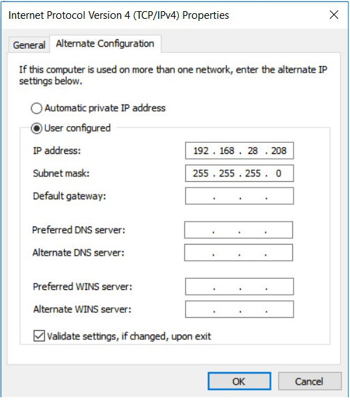
- The special case of this issue that has bothered me for years can be seen on the IPv4 configuration screen on Windows. An IP address consists of 4 one-to-three digit numbers separated by periods. While other systems let you enter it all in one textbox, and you have to type the periods as well (leaving us in total control), Windows’ designers decided to make it fancier – there are four textboxes and the periods are ornamental pieces between them. It’s nifty, except that if you are typing any number less than 100, you fill only two places in a 3-digit field, and you cannot move to the next field except by clicking it using your mouse or trackpad. The tab key takes you to the next group of fields. Pressing a backspace on an empty field doesn’t take you to the previous field either. I’ve seen this behaviour and been annoyed with it for years now, but nothing seems to have changed here over multiple versions.
- The special case of this issue that has bothered me for years can be seen on the IPv4 configuration screen on Windows. An IP address consists of 4 one-to-three digit numbers separated by periods. While other systems let you enter it all in one textbox, and you have to type the periods as well (leaving us in total control), Windows’ designers decided to make it fancier – there are four textboxes and the periods are ornamental pieces between them. It’s nifty, except that if you are typing any number less than 100, you fill only two places in a 3-digit field, and you cannot move to the next field except by clicking it using your mouse or trackpad. The tab key takes you to the next group of fields. Pressing a backspace on an empty field doesn’t take you to the previous field either. I’ve seen this behaviour and been annoyed with it for years now, but nothing seems to have changed here over multiple versions.
As you can see in the examples above, designers at times go overboard in over-designing interactions where it’s not needed, breaking away from the expected pattern, thus leaving the user confused or worse still, frustrated. These mistakes are almost always avoidable, simply by falling back on the most used and easily available pattern. This goes for taps as well 🙂
What are some of the examples of over-designing, in software or other products, that you have come across?


